
The Flayr brand
How the logo, colour, type, imagery and words fit together — so everything we make, from a title card to an invoice, looks and sounds like it came from the same studio.

A wordmark and three circles.
The lower-case wordmark says who we are; the circles — a small deep teal, a large teal and a light mint overlapping it — are the mark. Use the artwork as supplied. Never redraw it.
Two lockups


On light and on dark
Colour on light backgrounds. On navy, ink or photography use the reversed version: the wordmark turns white and the circles stay exactly as they are.




Use the mark on its own only where the name has already been seen or there is no room for it: avatars, favicons, app icons, watermarks, the corner of a video.
Clear space
Keep an empty margin on every side at least as big as the small deep-teal circle is tall — about a quarter of the logo’s height. Nothing goes inside it: no text, no edges of the frame, no other logos.
Minimum size
- Logo on screen
- 22 px tall (about 77 px wide) — the size in the site’s navigation
- Logo in print
- 8 mm tall (about 28 mm wide)
- Flayr Films
- 30 px / 10 mm tall, so FILMS stays readable
- Mark alone
- 16 px; below that the small circle disappears
Please don’t




Navy and teal are the brand.
Everything else supports them. Tap a value to copy it.
Core palette
Flayr Navy
The primary brand colour. Backgrounds, wordmark, headings, and every dark surface.
Flayr Teal
The signature accent. The mark, highlights, links, and calls to action.
White
Primary background in light contexts and the reversed logo colour.
Extended palette
Deep Teal
Teal at depth. Hover states, secondary charts, and teal text on white where contrast matters.
Mint
Light teal wash for tints, backgrounds, and highlight fills.
Cyan Pop
The brightest circle in the mark. Reserve for small emphasis only.
Slate
Neutral dark for body copy on light, and panels that must sit back from navy.
Slate Mid
Secondary text, captions, metadata, and dividers.
Ink
Deepest tone. Video letterboxing, code surfaces, and true-black alternatives.
Accent palette
Signal Blue
Digital-only accent for interactive states and data. Never in the logo.
Blue Light
Supporting tint for Signal Blue in charts and diagrams.
Neutral palette
Grey Light
Rules, borders, disabled states, and placeholder fills.
Off White
Page background and card surfaces where pure white is too stark.
CMYK marked * is a calculated conversion rather than an authored print build. Mint’s is calculated on purpose: the old palette artwork repeated Flayr Teal’s values for it. Pantone references are the closest matches to the hex values; ask the printer for a draw-down on the actual stock before a spot-colour job.
Proportion
Roughly how a typical layout divides: mostly light, navy for weight, teal to point.
Contrast
Text must pass WCAG AA: 4.5:1 for body text, 3:1 for large text (24 px, or 19 px bold) and graphics. Flayr Teal on white is 2.2:1, so it is for large shapes and the mark only — for teal text and links on light backgrounds the site uses a darker teal ink, , which passes AA.
All values
| Colour | HEX | RGB | CMYK | Pantone | On the website |
|---|---|---|---|---|---|
| Flayr Navy | 5255 C · 5255 U | --navy |
|||
| Flayr Teal | 338 C · 338 U | --teal |
|||
| White | — | --surface |
|||
| Deep Teal | 7717 C · 7717 U | --teal-deep |
|||
| Mint | 331 C · 331 U | --mint-brand |
|||
| Cyan Pop | — | --cyan |
|||
| Slate | — | --text |
|||
| Slate Mid | — | --muted |
|||
| Ink | — | --ink |
|||
| Signal Blue | — | --signal |
|||
| Blue Light | — | — | |||
| Grey Light | — | — | |||
| Off White | — | — |
Website colours
The site is light: a #FAFAFC page, white surfaces and no borders — depth comes from the contrast between surfaces. These are the tokens in its stylesheet.
One typeface: Geist.
Geist, by Vercel, for headings and text alike. Clean, a little technical, very readable at every size. Free under the SIL Open Font Licence.
ABCDEFGHIJKLMNOPQRSTUVWXYZ
abcdefghijklmnopqrstuvwxyz
0123456789 £€$%&@?!()—“”
The type scale
The sizes the website uses. Headings scale with the screen between the two values shown; tight negative letter-spacing on large sizes keeps them from looking loose.
Films that know what they’re for
Films that know what they’re for
Films that know what they’re for
Films that know what they’re for
Films that know what they’re for
Films that know what they’re for
Films that know what they’re for
Films that know what they’re for
Films that know what they’re for
Headings
- Sentence case, always: “Our work”, not “Our Work” or “OUR WORK”.
- Semibold (600); the hero line only at 650.
- Short. A heading says one thing; the line under it explains.
- No full stop on labels; a full stop on a sentence headline is fine.
Paragraphs
- Regular (400), 17 px on screen, line height 1.47; 9–10 pt in print.
- Lines of 60–75 characters. Wide text gets a narrower column, not smaller type.
- Ink (#0D1625) for headings, Slate (#343B49) for text, Slate Mid for captions.
- Geist Mono for timecodes, codecs and file names only.
Real work, framed simply.
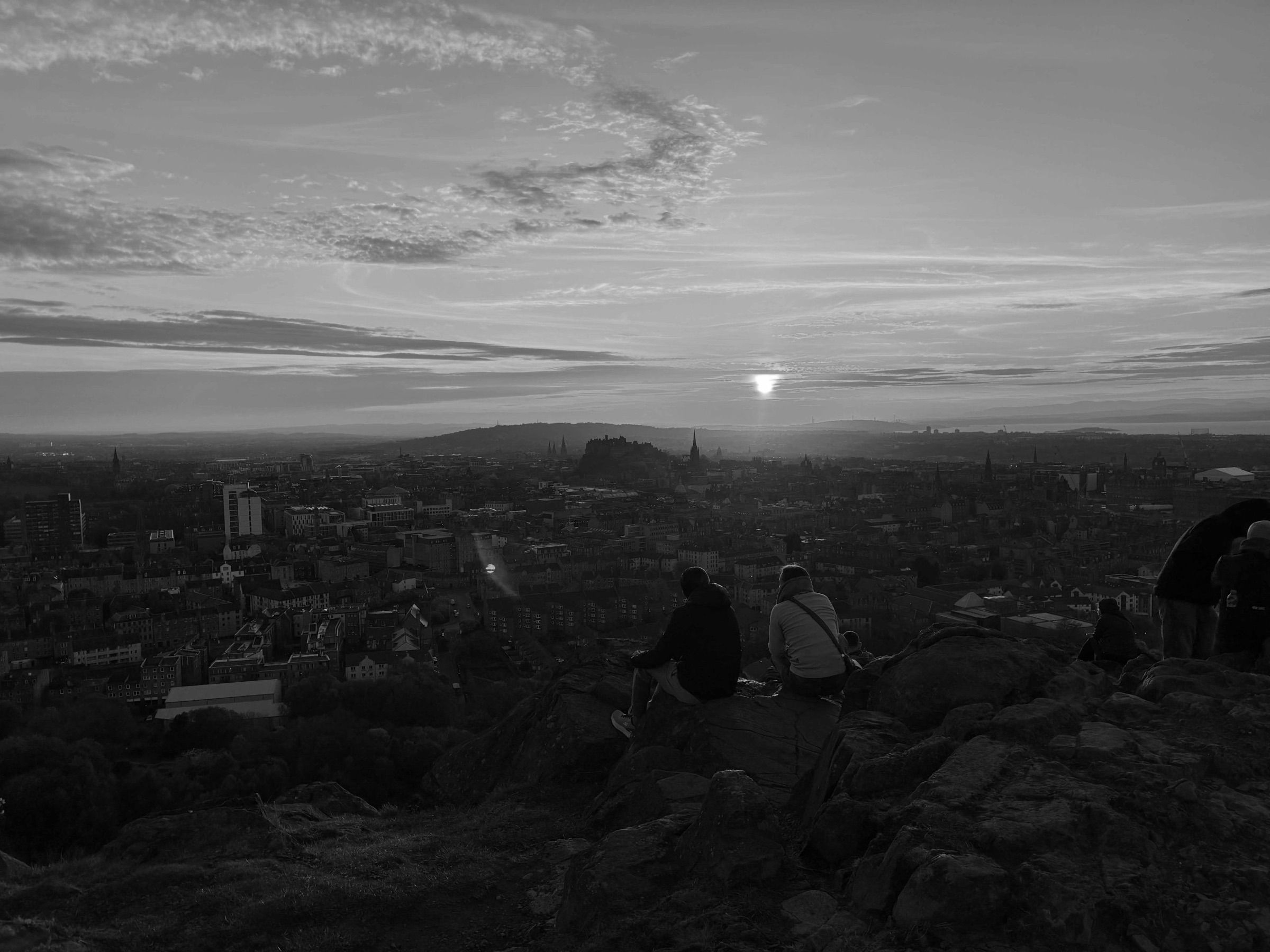
Stills from our own productions, behind-the-scenes moments and the people we film. Presented the same way everywhere: rounded corners, light backgrounds, no borders.
From the website.





Rounded corners
Every image and video gets rounded corners: 20 px on cards and inline images, 28 px on large tiles and heroes. Never square, never circular crops of scenes.
No borders, no frames
No keylines, drop shadows, polaroid frames or device mock-ups. An image sits straight on the light background or inside a white card.
Light backgrounds
Pages are #FAFAFC with white surfaces. Dark navy is for a single feature tile or a video, not whole pages.
Our own footage
Real productions and real people over stock. Where stills from different shoots sit together, give them one treatment — black and white, or a Signal Blue duotone as on the website — never a mix of filters.
One idea per frame
Crop tight enough that it is obvious what the picture is about. Leave room to breathe around the subject.
Words stay in the page
No headlines baked into images — people can’t read them on phones and search engines can’t read them at all. Every image gets alt text that says what it shows.
Plain-spoken and sure of the work.
We write like a studio that has done this many times: say what it is, what it’s for and what happens next. “Video marketing services that know what they’re for.” — that’s the voice.
Say what it’s for
Lead with the outcome for the client, then the craft that gets there.
Specific beats impressive
Numbers, durations, formats and days. “Two days on location” says more than “a comprehensive shoot”.
Confident, not loud
No exclamation marks, no superlatives. The work carries the volume.
British and plain
UK spelling — colour, programme, organisation. Short sentences. Sentence-case headings.
| Write this | Not this |
|---|---|
| Video marketing services that know what they’re for. | Unleash the power of video to supercharge your brand! |
| One shoot day, a 60-second film and six cut-downs for social. | A comprehensive, end-to-end content solution. |
| We’ll send the first cut on Thursday. | Deliverables will be provided in due course. |
| Delivered in ProRes and H.264, with subtitles. | Cutting-edge, broadcast-quality, next-generation formats. |
| Prices exclude VAT. Two revision rounds are included. | Unbeatable prices with unlimited tweaks! |
| Film and post-production, Edinburgh and London. | Your passionate full-service creative media partner. |
Names and details
- In copy
- Flayr — capital F, always one word. The lower-case form belongs to the logo only.
- Film work
- Flayr Films, where the credit is for a production
- Legal name
- Flayr FX Limited — on invoices, contracts and the site footer, not in marketing copy
- Where
- Edinburgh and London
- Web and email
- flayrfx.com · studio@flayrfx.com
Everything, ready to use.
Logo files are PNG with transparent backgrounds, made from the 2027 master artwork.
The brand pack
Every logo file, the palette for Adobe apps (.ase), as CSS and as JSON, and a short read-me.



















Something missing? Ask at studio@flayrfx.com.